Cost Leak Root Cause Analysis
Purpose
This section provides a real-world example of how to detect cost leakage and identify its root cause using visual tools within the platform.
Step-by-Step Analysis
- Navigate to
Compute → Trend.
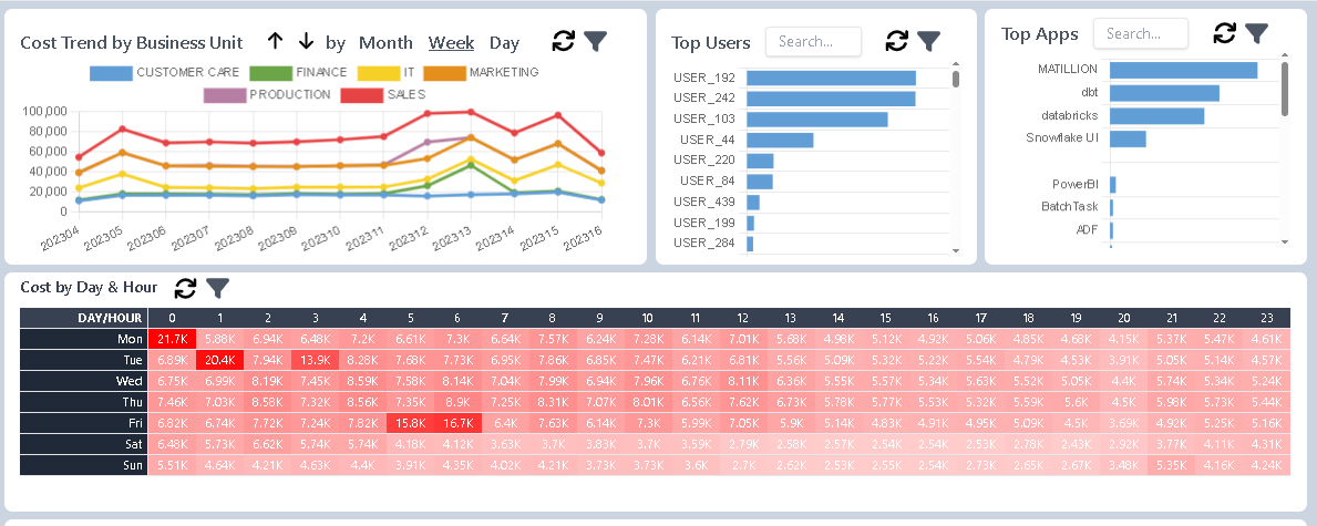
This page displays multiple interactive charts that provide insights into compute cost patterns. - Locate the “Cost by Day & Hour” matrix.
Found on the second row, this matrix shows days of the week as rows and hours of the day as columns. Darker cells indicate higher compute costs. - Identify anomalies.
Look for cells with significantly darker shades — e.g., Monday 12:00 AM or Tuesday 1:00 AM — which may indicate unusual spikes in usage. - Drill into the anomaly.
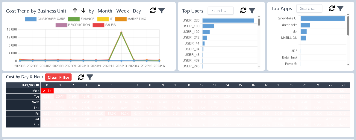
Click on the suspicious cell. The other charts will update to reflect the selection:- The first chart might reveal a spike in Week 13 tied to the Finance team.
- The user breakdown chart may highlight User 220 as the primary contributor.
- The interface chart could indicate Snowflake UI as the query origin, suggesting ad hoc querying behavior.
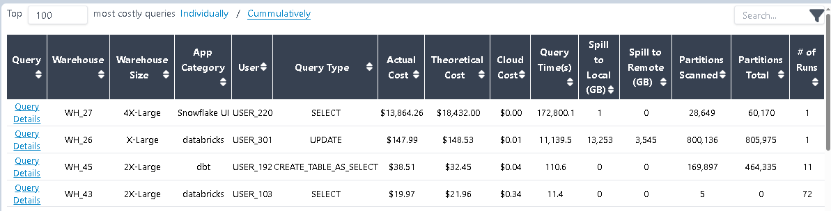
- View the list of queries.
Right-click the spike and select "Query List" from the context menu. You'll be redirected to theTop Querypage, showing all queries relevant to your selection. In this case, the top query alone cost $13.8K. - Inspect query details.
Click "Query Details" to examine the full SQL and metadata. The investigation shows:- User 220 executed a problematic query using a 4X-Large warehouse.
- The query ran for 3 days before Snowflake's timeout mechanism killed it.
- By then, it had already incurred $13.8K in compute charges.
Conclusion
This walkthrough demonstrates how to quickly identify and trace the root cause of unexpected compute costs using the platform’s built-in visualization tools — all within a few clicks.
Note: To prevent incidents like this, we strongly recommend enabling real-time query monitoring. For more information, see Query Monitor.